클러스터링이란?
서로 가까이 있는 군집
- intra-cluster(군집 내 거리): 군집 사이의 데이터들의 거리는 가까울수록 좋음
- inter-cluster(군집 간 거리): 각각의 군집 사이의 거리는 멀수록 좋음
[활용]
1. 요약 및 시각화: 전체 특성 파악
2. 데이터 이해: 분포 및 특성 확인
3. 전략 수립: 이상치 탐지, 세분화, 필터링, 마켓팅
K-means 클러스터링
K개의 군집으로 나누는 분할 기반 클러스터링
(장점) 단순하고 빠름
(단점) k지정 필요, 이상치에 민감
K: 하이퍼 파라미터(사용자 지정 값)
1. n_clusters (클러스터 개수)
- 역할: 생성할 클러스터의 개수를 지정
- 중요도: 가장 중요한 파라미터
- 주의사항:
- 너무 작으면 과소분할 (underfitting)
- 너무 크면 과분할 (overfitting)
2. random_state (난수 시드)
- 역할: 초기 중심점 선택의 랜덤성 제어
- 설정값: 임의의 정수 (일반적으로 42, 0, 123 등)
- 중요성:
- 재현 가능한 결과 보장
- 실험 결과 비교 가능
- 디버깅과 검증에 필수
- 효과: 같은 random_state 값이면 항상 동일한 결과, 없으면 매번 다른 결과
3. max_iter (최대 반복 횟수)
- 역할: 수렴하지 않을 때 강제 종료할 반복 횟수
- 기본값: 300
- 수렴 조건: 중심점 변화량이 임계값(tol) 이하가 되면 조기 종료
- 설정 가이드라인:
- 작은 데이터셋 (< 1,000개): max_iter=100
- 중간 데이터셋 (1,000~10,000개): max_iter=300 (기본값)
- 큰 데이터셋 (> 10,000개): max_iter=500+
4. init (초기화 방법)
- k-means++: 스마트한 초기화 (기본값, 강력 권장)
- 중심점들을 서로 멀리 배치
- 더 좋은 결과와 빠른 수렴
- 논문에서 이론적으로 입증된 방법
- random: 완전 랜덤 초기화
- 빠른 초기화
- 지역 최적해에 빠질 위험 높음
다양한 거리
1. 유클리드 거리: 두 점 사이의 직선 거리
2. 맨하탄 거리: 두점 사이의 각 차원별 절댓값 차이의 합
3. 코사인 거리: 두 벡터 사이의 각도를 이용한 거리(방향의 유사성)
4. 자카드 거리: 유사도의 보수로 정의되는 거리
연속형 데이터 (Continuous Data)
- 모든 특성이 비슷한 스케일: 유클리드 거리
- 이상치가 많은 경우: 맨하탄 거리
- 특성 간 스케일 차이가 큰 경우: 표준화 후 유클리드 거리
고차원 데이터 (High-dimensional Data)
- 텍스트 데이터, 단어 빈도: 코사인 거리
- 유전자 발현 데이터: 피어슨 상관계수 기반 거리
범주형 데이터 (Categorical Data)
- 자카드 거리 (Jaccard Distance)
[동작 원리]
1. 군집의 개수(K) 설정
2. 초기 중심점(Centroid) 설정
3. 데이터를 군집에 할당
4. 중심점 갱신
5. 수렵까지 반복
[코드]
1단계: 라이브러리 import
# 필요한 라이브러리 import
from sklearn.cluster import KMeans
from sklearn.datasets import load_iris
import pandas as pd
import numpy as np
import matplotlib.pyplot as plt
2단계: 데이터 로드
# Iris 데이터셋 로드
iris = load_iris()
X = iris.data  # 특성 데이터 (꽃잎, 꽃받침 길이/너비)
y_true = iris.target  # 실제 붓꽃 종류 (정답)
feature_names = iris.feature_names
target_names = iris.target_names

print("=== Iris 데이터셋 정보 ===")
print(f"데이터 크기: {X.shape}")
print(f"특성 이름: {feature_names}")
print(f"붓꽃 종류: {target_names}")
print(f"각 종류별 개수: {np.bincount(y_true)}")

# 데이터를 DataFrame으로 변환하여 살펴보기
iris_df = pd.DataFrame(X, columns=feature_names)
iris_df['species'] = [target_names[i] for i in y_true]

print(f"\n데이터 샘플:")
print(iris_df.head())

print(f"\n데이터 기본 통계:")
print(iris_df.describe().round(2))
3단계: 시각화
# 꽃받침 길이 vs 너비 시각화
plt.figure(figsize=(10, 6))

colors = ['red', 'blue', 'green']
for i, species in enumerate(target_names):
    mask = y_true == i
    plt.scatter(X[mask, 0], X[mask, 1], c=colors[i], label=species, alpha=0.7, s=60)

plt.xlabel('Sepal Length (cm)')
plt.ylabel('Sepal Width (cm)')
plt.title('Iris Dataset - Sepal Features')
plt.legend()
plt.grid(True, alpha=0.3)
plt.show()
# 꽃잎 길이 vs 너비 시각화
plt.figure(figsize=(10, 6))

for i, species in enumerate(target_names):
    mask = y_true == i
    plt.scatter(X[mask, 2], X[mask, 3], c=colors[i], label=species, alpha=0.7, s=60)

plt.xlabel('Petal Length (cm)')
plt.ylabel('Petal Width (cm)')
plt.title('Iris Dataset - Petal Features')
plt.legend()
plt.grid(True, alpha=0.3)
plt.show()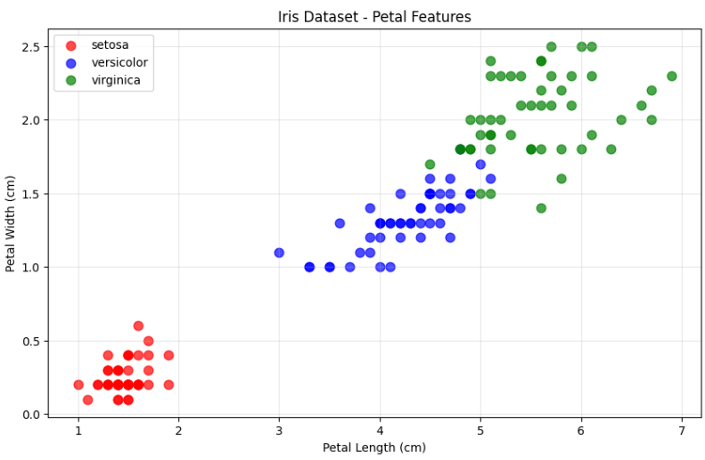
# 각 특성별 분포 시각화
plt.figure(figsize=(15, 10))

feature_names_short = ['Sepal Length', 'Sepal Width', 'Petal Length', 'Petal Width']

for i in range(4):
    plt.subplot(2, 2, i+1)

    for j, species in enumerate(target_names):
        mask = y_true == j
        plt.hist(X[mask, i], alpha=0.7, label=species, bins=15, color=colors[j])

    plt.xlabel(f'{feature_names_short[i]} (cm)')
    plt.ylabel('Frequency')
    plt.title(f'Distribution of {feature_names_short[i]}')
    plt.legend()
    plt.grid(True, alpha=0.3)

plt.tight_layout()
plt.show()
4단계: 모델 생성, 하이퍼파라미터 설명
kmeans = KMeans(
    n_clusters=3,        # 3 iris species (domain knowledge)
    random_state=42,     # For reproducible results
    n_init=10,          # Run 10 times with different initializations
    max_iter=300,       # Maximum number of iterations
)
5단계: 모델 학습 및 예측
# fit_predict: 학습과 예측을 한 번에 수행
cluster_labels = kmeans.fit_predict(X)

# 학습 결과 정보
print("Model training completed!")
print(f"Number of centroids: {len(kmeans.cluster_centers_)}")
print(f"Actual iterations performed: {kmeans.n_iter_}")
print(f"WSS (Inertia): {kmeans.inertia_:.2f}")

# 클러스터 중심점 출력
print(f"\nCluster Centroids:")
for i, centroid in enumerate(kmeans.cluster_centers_):
    print(f"Cluster {i}: [Sepal L:{centroid[0]:.2f}, Sepal W:{centroid[1]:.2f}, "
          f"Petal L:{centroid[2]:.2f}, Petal W:{centroid[3]:.2f}]")

# 각 클러스터에 할당된 데이터 개수
unique, counts = np.unique(cluster_labels, return_counts=True)
print(f"\nData points assigned to each cluster:")
for cluster_id, count in zip(unique, counts):
    print(f"Cluster {cluster_id}: {count} samples")
6단계: 클러스터링 결과 분석
# 꽃받침 특성으로 클러스터링 결과 시각화
plt.figure(figsize=(15, 5))

# 1. 실제 정답 (꽃받침)
plt.subplot(1, 3, 1)
for i, species in enumerate(target_names):
    mask = y_true == i
    plt.scatter(X[mask, 0], X[mask, 1], c=colors[i], label=f'{species} (True)', alpha=0.7, s=60)
plt.xlabel('Sepal Length (cm)')
plt.ylabel('Sepal Width (cm)')
plt.title('True Iris Species (Sepal Features)')
plt.legend()
plt.grid(True, alpha=0.3)

# 2. K-means 결과 (꽃받침)
plt.subplot(1, 3, 2)
plt.scatter(X[:, 0], X[:, 1], c=cluster_labels, cmap='viridis', alpha=0.7, s=60)
plt.scatter(kmeans.cluster_centers_[:, 0], kmeans.cluster_centers_[:, 1],
            c='red', marker='x', s=300, linewidths=4, label='Centroids')
plt.xlabel('Sepal Length (cm)')
plt.ylabel('Sepal Width (cm)')
plt.title('K-means Result (Sepal Features)')
plt.legend()
plt.grid(True, alpha=0.3)

# 3. 클러스터 경계 시각화
plt.subplot(1, 3, 3)
# 결정 경계를 그리기 위한 격자 생성
h = 0.02  # 격자 간격
x_min, x_max = X[:, 0].min() - 1, X[:, 0].max() + 1 # Sepal Length 범위
y_min, y_max = X[:, 1].min() - 1, X[:, 1].max() + 1 # Sepal Width 범위
xx, yy = np.meshgrid(np.arange(x_min, x_max, h),
                      np.arange(y_min, y_max, h))

# 격자점에서 클러스터 예측 (꽃받침 특성만 사용)
# 꽃잎 특성은 평균값으로 고정
petal_mean = X[:, 2:].mean(axis=0) # Petal Length, Petal Width의 평균
grid_points = np.c_[xx.ravel(), yy.ravel(), # Sepal Length, Sepal Width 격자점
                    np.full(xx.ravel().shape, petal_mean[0]), # 고정된 Petal Length 평균
                    np.full(xx.ravel().shape, petal_mean[1])] # 고정된 Petal Width 평균

Z = kmeans.predict(grid_points)
Z = Z.reshape(xx.shape)

# 결정 경계 그리기
plt.contourf(xx, yy, Z, alpha=0.3, cmap='viridis')
plt.scatter(X[:, 0], X[:, 1], c=cluster_labels, cmap='viridis', alpha=0.8, s=60, edgecolors='black')
plt.scatter(kmeans.cluster_centers_[:, 0], kmeans.cluster_centers_[:, 1],
            c='red', marker='x', s=300, linewidths=4, label='Centroids')
plt.xlabel('Sepal Length (cm)')
plt.ylabel('Sepal Width (cm)')
plt.title('Cluster Decision Boundaries')
plt.legend()
plt.grid(True, alpha=0.3)

plt.tight_layout()
plt.show()
# 꽃잎 특성으로 클러스터링 결과 시각화 (더 명확한 분리 예상)
plt.figure(figsize=(15, 5))

# 1. 실제 정답 (꽃잎)
plt.subplot(1, 3, 1)
for i, species in enumerate(target_names):
    mask = y_true == i
    plt.scatter(X[mask, 2], X[mask, 3], c=colors[i], label=f'{species} (True)', alpha=0.7, s=60)
plt.xlabel('Petal Length (cm)')
plt.ylabel('Petal Width (cm)')
plt.title('True Iris Species (Petal Features)')
plt.legend()
plt.grid(True, alpha=0.3)

# 2. K-means 결과 (꽃잎)
plt.subplot(1, 3, 2)
plt.scatter(X[:, 2], X[:, 3], c=cluster_labels, cmap='viridis', alpha=0.7, s=60)
plt.scatter(kmeans.cluster_centers_[:, 2], kmeans.cluster_centers_[:, 3],
           c='red', marker='x', s=300, linewidths=4, label='Centroids')
plt.xlabel('Petal Length (cm)')
plt.ylabel('Petal Width (cm)')
plt.title('K-means Result (Petal Features)')
plt.legend()
plt.grid(True, alpha=0.3)

# 3. 클러스터 경계 시각화
plt.subplot(1, 3, 3)
# 결정 경계를 그리기 위한 격자 생성
h = 0.02  # 격자 간격
x_min, x_max = X[:, 2].min() - 1, X[:, 2].max() + 1
y_min, y_max = X[:, 3].min() - 1, X[:, 3].max() + 1
xx, yy = np.meshgrid(np.arange(x_min, x_max, h),
                     np.arange(y_min, y_max, h))

# 격자점에서 클러스터 예측 (꽃잎 특성만 사용)
# 꽃받침 특성은 평균값으로 고정
sepal_mean = X[:, :2].mean(axis=0)
grid_points = np.c_[np.full(xx.ravel().shape, sepal_mean[0]),
                   np.full(xx.ravel().shape, sepal_mean[1]),
                   xx.ravel(), yy.ravel()]
Z = kmeans.predict(grid_points)
Z = Z.reshape(xx.shape)

# 결정 경계 그리기
plt.contourf(xx, yy, Z, alpha=0.3, cmap='viridis')
plt.scatter(X[:, 2], X[:, 3], c=cluster_labels, cmap='viridis', alpha=0.8, s=60, edgecolors='black')
plt.scatter(kmeans.cluster_centers_[:, 2], kmeans.cluster_centers_[:, 3],
           c='red', marker='x', s=300, linewidths=4, label='Centroids')
plt.xlabel('Petal Length (cm)')
plt.ylabel('Petal Width (cm)')
plt.title('Cluster Decision Boundaries')
plt.legend()
plt.grid(True, alpha=0.3)

plt.tight_layout()
plt.show()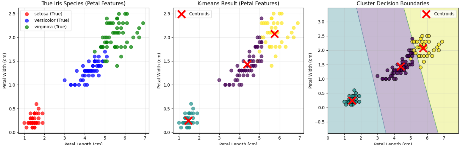
# 꽃잎 특성으로 시각화 (더 명확한 분리 예상)
plt.figure(figsize=(15, 5))

# 1. 실제 정답 (꽃잎)
plt.subplot(1, 3, 1)
for i, species in enumerate(target_names):
    mask = y_true == i
    plt.scatter(X[mask, 2], X[mask, 3], c=colors[i], label=species, alpha=0.7, s=60)
plt.xlabel('Petal Length (cm)')
plt.ylabel('Petal Width (cm)')
plt.legend()
plt.grid(True, alpha=0.3)

# 2. K-means 결과 (꽃잎)
plt.subplot(1, 3, 2)
plt.scatter(X[:, 2], X[:, 3], c=cluster_labels, cmap='viridis', alpha=0.7, s=60)
plt.scatter(kmeans.cluster_centers_[:, 2], kmeans.cluster_centers_[:, 3],
           c='red', marker='x', s=300, linewidths=4)
plt.xlabel('Petal Length (cm)')
plt.ylabel('Petal Width (cm)')
plt.legend()
plt.grid(True, alpha=0.3)

# 3. 오분류 데이터 강조
plt.subplot(1, 3, 3)
# 올바르게 분류된 것은 연하게
plt.scatter(X[:, 2], X[:, 3], c=cluster_labels, cmap='viridis', alpha=0.3, s=60)

# 오분류된 데이터 찾기 및 강조
# 각 클러스터의 주요 종류 찾기
cluster_to_species = {}
for cluster_id in range(3):
    cluster_mask = cluster_labels == cluster_id
    species_in_cluster = y_true[cluster_mask]
    dominant_species = np.argmax(np.bincount(species_in_cluster))
    cluster_to_species[cluster_id] = dominant_species

# 오분류 찾기
misclassified = []
for i in range(len(X)):
    predicted_cluster = cluster_labels[i]
    expected_species = cluster_to_species[predicted_cluster]
    actual_species = y_true[i]
    if actual_species != expected_species:
        misclassified.append(i)

# 오분류 데이터 강조 표시
if misclassified:
    plt.scatter(X[misclassified, 2], X[misclassified, 3],
               c='red', marker='o', s=100, alpha=0.8,
               edgecolors='black', linewidth=2, label=f'miss ({len(misclassified)})')

plt.scatter(kmeans.cluster_centers_[:, 2], kmeans.cluster_centers_[:, 3],
           c='orange', marker='x', s=300, linewidths=4)
plt.xlabel('Petal Length (cm)')
plt.ylabel('Petal Width (cm)')
plt.legend()
plt.grid(True, alpha=0.3)

plt.tight_layout()
plt.show()

print(f"꽃잎 특성에서 오분류된 데이터: {len(misclassified)}개")
if misclassified:
    print("오분류된 데이터의 인덱스:", misclassified[:10])  # 처음 10개만 표시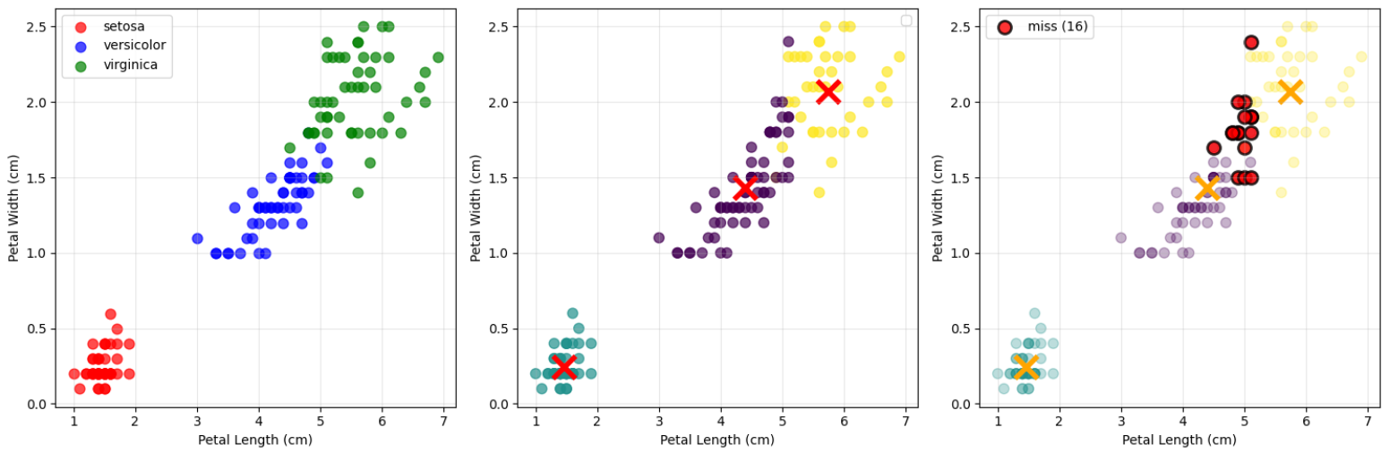
[거리 예시 코드]
# 운동선수 능력치 데이터로 거리 방법 비교
import numpy as np
import matplotlib.pyplot as plt
from sklearn.preprocessing import StandardScaler, normalize
from sklearn.cluster import KMeans
import pandas as pd

# 1단계: 축구선수 능력치 데이터 생성
np.random.seed(42)
n_players = 300

# 능력치 항목
abilities = ['슛팅', '패스', '드리블', '수비', '체력', '스피드', '헤딩']

# 포지션별 선수 생성 (각 포지션마다 다른 능력치 패턴)
positions = ['공격수', '미드필더', '수비수']
n_per_position = n_players // 3

player_data = []
true_positions = []

for pos_idx, position in enumerate(positions):
    for i in range(n_per_position):
        if position == '공격수':
            # 공격수: 슛팅, 드리블, 스피드가 상대적으로 높음
            base_pattern = [0.8, 0.6, 0.8, 0.3, 0.6, 0.8, 0.7]
            skill_level = np.random.uniform(0.4, 0.95)

        elif position == '미드필더':
            # 미드필더: 패스, 체력이 상대적으로 높음
            base_pattern = [0.6, 0.9, 0.7, 0.6, 0.8, 0.6, 0.5]
            skill_level = np.random.uniform(0.4, 0.95)

        else:  # 수비수
            # 수비수: 수비, 헤딩, 체력이 상대적으로 높음
            base_pattern = [0.3, 0.7, 0.4, 0.9, 0.8, 0.5, 0.8]
            skill_level = np.random.uniform(0.4, 0.95)

        # 패턴에 전체 능력 수준 적용 + 노이즈 추가
        abilities_values = []
        for base_val in base_pattern:
            final_val = np.clip((base_val * skill_level + np.random.normal(0, 0.1)), 0, 1)
            abilities_values.append(final_val * 100)  # 0-100 스케일로 변환

        player_data.append(abilities_values)
        true_positions.append(pos_idx)

# 데이터프레임 생성
player_df = pd.DataFrame(player_data, columns=abilities)
player_df['position'] = [positions[pos] for pos in true_positions]

# 능력치 데이터만 추출
X_abilities = player_df[abilities].values
y_true = np.array(true_positions)

print("=== 축구선수 능력치 데이터 ===")
print(f"선수 데이터 크기: {player_df.shape}")
print(f"포지션별 선수 수: {player_df['position'].value_counts().to_dict()}")
print("\n포지션별 평균 능력치:")
for pos in positions:
    pos_data = player_df[player_df['position'] == pos][abilities]
    print(f"{pos}:")
    for ability in abilities:
        print(f"  {ability}: {pos_data[ability].mean():.1f}")
# 2단계: 유클리드 거리와 코사인 거리 기반 클러스터링 비교
# 유클리드 거리 기반 클러스터링 (표준화 적용)
scaler = StandardScaler()
X_scaled = scaler.fit_transform(X_abilities)
kmeans_euclidean = KMeans(n_clusters=3, random_state=42)
labels_euclidean = kmeans_euclidean.fit_predict(X_scaled)
# 코사인 거리 기반 클러스터링 (L2 정규화 후 유클리드 거리)
X_normalized = normalize(X_abilities, norm='l2')
kmeans_cosine = KMeans(n_clusters=3, random_state=42)
labels_cosine = kmeans_cosine.fit_predict(X_normalized)# 클러스터링 결과 확인하기
import matplotlib.font_manager as fm
plt.rcParams['font.family'] = 'Malgun Gothic' # 맑은 고딕
plt.figure(figsize=(15, 5))
# 포지션별 평균 능력치 패턴
plt.subplot(1, 3, 1)
for pos_idx, pos_name in enumerate(positions):
pos_data = player_df[player_df['position'] == pos_name][abilities].mean()
plt.plot(range(len(abilities)), pos_data.values, 'o-',
label=pos_name, linewidth=3, markersize=8)
plt.xlabel('Ability Attributes')
plt.ylabel('Average Ability Score')
plt.title('Average Ability Patterns by Position')
plt.xticks(range(len(abilities)), abilities, rotation=45)
plt.legend()
plt.grid(True, alpha=0.3)
# 같은 패턴, 다른 수준의 선수 비교
plt.subplot(1, 3, 2)
x_pos = np.arange(len(abilities))
width = 0.35
plt.bar(x_pos - width/2, low_abilities, width,
label=f'Low-level Striker (Total: {low_abilities.sum():.0f})',
alpha=0.7, color='orange')
plt.bar(x_pos + width/2, high_abilities, width,
label=f'High-level Striker (Total: {high_abilities.sum():.0f})',
alpha=0.7, color='red')
plt.xlabel('Abilities')
plt.ylabel('Ability Score')
plt.title(f'Same Pattern, Different Levels\nCosine Distance: {cosine_dist:.4f}')
plt.xticks(x_pos, abilities, rotation=45)
plt.legend()
plt.grid(True, alpha=0.3)
# 전체 능력치 합 분포
plt.subplot(1, 3, 3)
total_abilities = X_abilities.sum(axis=1)
colors = ['red', 'blue', 'green']
for i, pos_name in enumerate(positions):
mask = y_true == i
plt.hist(total_abilities[mask], alpha=0.6, label=pos_name,
bins=15, color=colors[i])
plt.xlabel('Total Ability Sum')
plt.ylabel('Number of Players')
plt.title('Total Ability Distribution by Position')
plt.legend()
plt.grid(True, alpha=0.3)
plt.tight_layout()
plt.show()# 5단계: 직관적인 2차원 시각화로 클러스터링 결과 비교
plt.figure(figsize=(20, 10))
# 현재 abilities 리스트 확인 후 적절한 인덱스 사용
if 'Shooting' in abilities:
shooting_idx = abilities.index('Shooting')
defense_idx = abilities.index('Defense')
pass_idx = abilities.index('Passing')
dribble_idx = abilities.index('Dribbling')
else:
# 한글 버전인 경우
shooting_idx = abilities.index('슛팅')
defense_idx = abilities.index('수비')
pass_idx = abilities.index('패스')
dribble_idx = abilities.index('드리블')
# 슛팅 vs 수비 (공격수와 수비수를 구분하기 좋은 축)
plt.subplot(2, 3, 1)
colors = ['red', 'blue', 'green']
for i, pos_name in enumerate(positions):
mask = y_true == i
plt.scatter(X_abilities[mask, shooting_idx], X_abilities[mask, defense_idx],
c=colors[i], label=pos_name, alpha=0.6, s=50)
plt.xlabel('Shooting Ability')
plt.ylabel('Defense Ability')
plt.title('True Positions (Shooting vs Defense)')
plt.legend()
plt.grid(True, alpha=0.3)
# 유클리드 거리 클러스터링 결과 (슛팅 vs 수비)
plt.subplot(2, 3, 2)
plt.scatter(X_abilities[:, shooting_idx], X_abilities[:, defense_idx],
c=labels_euclidean, cmap='viridis', alpha=0.6, s=50)
plt.xlabel('Shooting Ability')
plt.ylabel('Defense Ability')
plt.title('Euclidean Distance Clustering')
plt.grid(True, alpha=0.3)
# 코사인 거리 클러스터링 결과 (슛팅 vs 수비)
plt.subplot(2, 3, 3)
plt.scatter(X_abilities[:, shooting_idx], X_abilities[:, defense_idx],
c=labels_cosine, cmap='plasma', alpha=0.6, s=50)
plt.xlabel('Shooting Ability')
plt.ylabel('Defense Ability')
plt.title('Cosine Distance Clustering')
plt.grid(True, alpha=0.3)
# 패스 vs 드리블 (미드필더 특성을 보기 좋은 축)
plt.subplot(2, 3, 4)
for i, pos_name in enumerate(positions):
mask = y_true == i
plt.scatter(X_abilities[mask, pass_idx], X_abilities[mask, dribble_idx],
c=colors[i], label=pos_name, alpha=0.6, s=50)
plt.xlabel('Passing Ability')
plt.ylabel('Dribbling Ability')
plt.title('True Positions (Passing vs Dribbling)')
plt.legend()
plt.grid(True, alpha=0.3)
# 유클리드 거리 클러스터링 결과 (패스 vs 드리블)
plt.subplot(2, 3, 5)
plt.scatter(X_abilities[:, pass_idx], X_abilities[:, dribble_idx],
c=labels_euclidean, cmap='viridis', alpha=0.6, s=50)
plt.xlabel('Passing Ability')
plt.ylabel('Dribbling Ability')
plt.title('Euclidean Distance Clustering')
plt.grid(True, alpha=0.3)
# 코사인 거리 클러스터링 결과 (패스 vs 드리블)
plt.subplot(2, 3, 6)
plt.scatter(X_abilities[:, pass_idx], X_abilities[:, dribble_idx],
c=labels_cosine, cmap='plasma', alpha=0.6, s=50)
plt.xlabel('Passing Ability')
plt.ylabel('Dribbling Ability')
plt.title('Cosine Distance Clustering')
plt.grid(True, alpha=0.3)
plt.tight_layout()
plt.show()
# 각 클러스터에 어떤 포지션이 많이 포함되었는지 확인
print("=== Position Distribution by Cluster ===")
print("\nEuclidean Distance Clustering Results:")
for cluster_id in range(3):
cluster_mask = labels_euclidean == cluster_id
cluster_positions = y_true[cluster_mask]
print(f"Cluster {cluster_id}:")
for pos_id, pos_name in enumerate(positions):
pos_count = np.sum(cluster_positions == pos_id)
percentage = pos_count / len(cluster_positions) * 100
print(f" {pos_name}: {pos_count} players ({percentage:.1f}%)")
print("\nCosine Distance Clustering Results:")
for cluster_id in range(3):
cluster_mask = labels_cosine == cluster_id
cluster_positions = y_true[cluster_mask]
print(f"Cluster {cluster_id}:")
for pos_id, pos_name in enumerate(positions):
pos_count = np.sum(cluster_positions == pos_id)
percentage = pos_count / len(cluster_positions) * 100
print(f" {pos_name}: {pos_count} players ({percentage:.1f}%)")- 선수 스카우팅 🔍
- 코사인 거리: "우리 팀 전술에 맞는 스타일의 선수"
- 유클리드 거리: "현재 주전급 수준의 선수"
- 팀 밸런스 분석 ⚖️
- 코사인 거리: 팀 내 다양한 스타일 보유 여부 확인
- 유클리드 거리: 팀 내 전력 격차 분석
- 경쟁 상대 분석 🏆
- 코사인 거리: 상대팀과 유사한 전술 스타일 파악
- 유클리드 거리: 상대팀과의 전력 차이 분석
클러스터링 = 비지도 학습 = 정답 X
1. 내재적 평가 (Intrinsic Evaluation)
- 클러스터링 자체의 품질을 측정
- 클러스터 내 응집도(intra-cluster cohesion)와 클러스터 간 분리도(inter-cluster separation) 평가
- 장점: 외부 정보 불필요, 빠른 평가 가능
- 단점: 비즈니스 목적과 일치하지 않을 수 있음
2. 외재적 평가 (Extrinsic Evaluation)
- 외부 기준(ground truth)과 비교하여 평가
- 실제 라벨이 있는 데이터셋에서만 사용 가능
- 장점: 객관적이고 명확한 평가
- 단점: 실무에서는 정답 라벨이 없는 경우가 대부분
3. 상대적 평가 (Relative Evaluation)
- 여러 클러스터링 결과를 상대 비교
- 다양한 K값이나 알고리즘 간 성능 비교
- 장점: 실무에서 가장 실용적
- 단점: 절대적 기준 부재
K개수 조정하기 = Elbow Method(엘보우 방법)
K 증가시 WSS 감소(세분화)
한계
- 주관적 판단: "팔꿈치" 지점이 명확하지 않은 경우가 많음
- 데이터 특성 의존: 데이터 분포에 따라 명확한 elbow가 나타나지 않을 수 있음
- 차원의 저주: 고차원 데이터에서는 WSS 감소가 선형적으로 나타날 수 있음
WSS란? 각 클러스터 내에서 중심점까지의 거리 제곱합, 응집도, 작을수록 밀집
import numpy as np
import matplotlib.pyplot as plt
from sklearn.cluster import KMeans
from sklearn.datasets import load_iris
from sklearn.preprocessing import StandardScaler

# 1단계: 데이터 준비
iris = load_iris()
X = iris.data
X_scaled = StandardScaler().fit_transform(X)

# 2단계: 다양한 K값에 대해 WSS 계산
k_range = range(1, 11)
wss_values = []

for k in k_range:
    kmeans = KMeans(n_clusters=k, random_state=42, n_init=10)
    kmeans.fit(X_scaled)
    wss_values.append(kmeans.inertia_)  # inertia_ = WSS

# 3단계: Elbow Method 시각화
plt.figure(figsize=(12, 5))

# WSS 변화 그래프
plt.subplot(1, 2, 1)
plt.plot(k_range, wss_values, 'bo-', linewidth=2, markersize=8)
plt.xlabel('Number of Clusters (K)')
plt.ylabel('Within-cluster Sum of Squares (WSS)')
plt.title('Elbow Method for Optimal K')
plt.grid(True, alpha=0.3)

# 각 K값에 WSS 값 표시
for i, wss in enumerate(wss_values):
    plt.annotate(f'{wss:.1f}', (k_range[i], wss),
                textcoords="offset points", xytext=(0,10), ha='center')

# WSS 감소율 그래프 (더 명확한 elbow 지점 찾기)
plt.subplot(1, 2, 2)
wss_diff = [wss_values[i] - wss_values[i+1] for i in range(len(wss_values)-1)]
k_range_diff = range(1, 10)
plt.plot(k_range_diff, wss_diff, 'ro-', linewidth=2, markersize=8)
plt.xlabel('Number of Clusters (K)')
plt.ylabel('WSS Reduction')
plt.title('WSS Reduction by Adding One More Cluster')
plt.grid(True, alpha=0.3)

# 각 지점에 감소량 표시
for i, diff in enumerate(wss_diff):
    plt.annotate(f'{diff:.1f}', (k_range_diff[i], diff),
                textcoords="offset points", xytext=(0,10), ha='center')

plt.tight_layout()
plt.show()

print("=== Elbow Method Analysis ===")
print("K\tWSS\tReduction")
print("-" * 25)
for i, k in enumerate(k_range):
    if i == 0:
        print(f"{k}\t{wss_values[i]:.1f}\t-")
    else:
        reduction = wss_values[i-1] - wss_values[i]
        print(f"{k}\t{wss_values[i]:.1f}\t{reduction:.1f}")
정량적 성능 평가 = 실루엣 스코어
각 데이터 포인트가 얼마나 적절한 클러스터에 할당되었는지 측정
[범위]
- 0.7 ~ 1.0: 강한 클러스터 구조
- 0.5 ~ 0.7: 중간 정도의 클러스터 구조
- 0.25 ~ 0.5: 약한 클러스터 구조
- < 0.25: 클러스터 구조가 거의 없음
- 클러스터 내 거리는 가까울수록 좋고 (compactness)
- 클러스터 간 거리는 멀수록 좋습니다. (separation)
from sklearn.metrics import silhouette_score
import pandas as pd

def silhouette_evaluation(X, k_range, random_state=42):
    """
    실루엣 스코어 중심의 클러스터링 평가
    """
    results = []

    for k in k_range:
        if k == 1:
            continue  # K=1일 때는 실루엣 스코어 계산 불가

        # K-means 클러스터링
        kmeans = KMeans(n_clusters=k, random_state=random_state, n_init=10)
        labels = kmeans.fit_predict(X)

        # 실루엣 스코어와 WSS 계산
        silhouette = silhouette_score(X, labels)
        wss = kmeans.inertia_

        results.append({
            'K': k,
            'WSS': wss,
            'Silhouette_Score': silhouette
        })

    return pd.DataFrame(results)

# 실루엣 평가 수행
evaluation_results = silhouette_evaluation(X_scaled, range(2, 11))

print("=== Silhouette Score Evaluation ===")
print(evaluation_results.round(4))

# 최적 K 찾기
optimal_k_silhouette = evaluation_results.loc[
    evaluation_results['Silhouette_Score'].idxmax(), 'K']

print(f"\n=== Optimal K by Silhouette Score ===")
print(f"Best K: {optimal_k_silhouette}")
print(f"Best Silhouette Score: {evaluation_results['Silhouette_Score'].max():.4f}")

# Elbow Method vs Silhouette Analysis 비교 시각화
plt.figure(figsize=(18, 6))

# 1. Elbow Method (WSS)
plt.subplot(1, 3, 1)
plt.plot(evaluation_results['K'], evaluation_results['WSS'],
         'bo-', linewidth=3, markersize=10)
plt.xlabel('Number of Clusters (K)', fontsize=12)
plt.ylabel('Within-cluster Sum of Squares (WSS)', fontsize=12)
plt.title('Elbow Method\n(Lower WSS is Better)', fontsize=14, fontweight='bold')
plt.grid(True, alpha=0.3)

# WSS 값을 각 점에 표시
for i, row in evaluation_results.iterrows():
    plt.annotate(f'{row["WSS"]:.1f}',
                (row['K'], row['WSS']),
                textcoords="offset points",
                xytext=(0,15),
                ha='center', fontsize=10)

# 2. Silhouette Analysis
plt.subplot(1, 3, 2)
plt.plot(evaluation_results['K'], evaluation_results['Silhouette_Score'],
         'go-', linewidth=3, markersize=10)
plt.axvline(x=optimal_k_silhouette, color='red', linestyle='--', linewidth=2,
           label=f'Optimal K = {optimal_k_silhouette}')
plt.xlabel('Number of Clusters (K)', fontsize=12)
plt.ylabel('Silhouette Score', fontsize=12)
plt.title('Silhouette Analysis\n(Higher Score is Better)', fontsize=14, fontweight='bold')
plt.legend(fontsize=11)
plt.grid(True, alpha=0.3)

# 실루엣 스코어 값을 각 점에 표시
for i, row in evaluation_results.iterrows():
    plt.annotate(f'{row["Silhouette_Score"]:.3f}',
                (row['K'], row['Silhouette_Score']),
                textcoords="offset points",
                xytext=(0,15),
                ha='center', fontsize=10)

# 3. 두 방법의 정규화된 비교
plt.subplot(1, 3, 3)
from sklearn.preprocessing import MinMaxScaler

# 정규화 (0-1 범위)
scaler = MinMaxScaler()

# WSS는 역순으로 정규화 (낮을수록 좋으므로)
wss_inverted = evaluation_results['WSS'].max() - evaluation_results['WSS']
wss_normalized = scaler.fit_transform(wss_inverted.values.reshape(-1, 1)).flatten()

# 실루엣 스코어는 그대로 정규화
silhouette_normalized = scaler.fit_transform(
    evaluation_results['Silhouette_Score'].values.reshape(-1, 1)).flatten()

plt.plot(evaluation_results['K'], wss_normalized,
         'bo-', linewidth=3, markersize=8, label='Elbow Method (Normalized)', alpha=0.7)
plt.plot(evaluation_results['K'], silhouette_normalized,
         'go-', linewidth=3, markersize=8, label='Silhouette Score (Normalized)', alpha=0.7)

plt.xlabel('Number of Clusters (K)', fontsize=12)
plt.ylabel('Normalized Score (0-1)', fontsize=12)
plt.title('Method Comparison\n(Higher is Better)', fontsize=14, fontweight='bold')
plt.legend(fontsize=11)
plt.grid(True, alpha=0.3)

plt.tight_layout()
plt.show()|
비교 항목
|
Elbow Method
|
Silhouette Analysis
|
|
측정 대상
|
클러스터 내 응집도만 측정 (WSS)
|
응집도 + 분리도 종합 측정
|
|
평가 관점
|
클러스터 중심과의 거리만 고려
|
개별 데이터 포인트 관점에서 평가
|
|
결과 해석
|
WSS 감소율의 변화로 판단 (주관적)
|
수치 자체가 품질을 나타냄 (객관적)
|
|
계산 복잡도
|
빠름 (중심점과의 거리만 계산)
|
상대적으로 느림 (모든 점 간 거리 계산)
|
|
장점
|
직관적이고 빠른 계산
|
클러스터 품질의 절대적 평가 가능
|
|
단점
|
명확한 elbow가 없을 수 있음
|
계산 비용이 높음
|
'특강 > 머신러닝' 카테고리의 다른 글
| [머신러닝 주요기법] 4회차 (07.03) 계층적 군집화, DBSCAN, 차원축소(PCA, t-SNE) (0) | 2025.07.03 |
|---|---|
| [머신러닝 주요기법] 2회차 (07.01) (2) | 2025.07.01 |
| [머신러닝 주요기법] 1회차 (06.30) (1) | 2025.06.30 |
| [머신러닝] 4회차 앙상블, 부스팅(06.27) (2) | 2025.06.27 |
| [머신러닝] 3회차 회귀분석 (06.26) (0) | 2025.06.26 |